8 Best Practices for Optimizing Contact Forms

A contact form can either be a gateway to valuable conversions – or a silent lead killer. The difference often lies in its optimization. These forms are frequently the final, crucial step in the conversion funnel, making their design and performance absolutely critical to success.
Get it right, and you open a direct line to your customers. Get it wrong, and you create a frustrating roadblock that sends potential leads scurrying away.
This article is here to help you get it right. We will explore eight proven, actionable best practices that will help you create high-converting, user-friendly contact forms.
By implementing these strategies, you can significantly boost form completion rates, improve the quality of the data you receive, and enhance the overall user experience on your website.
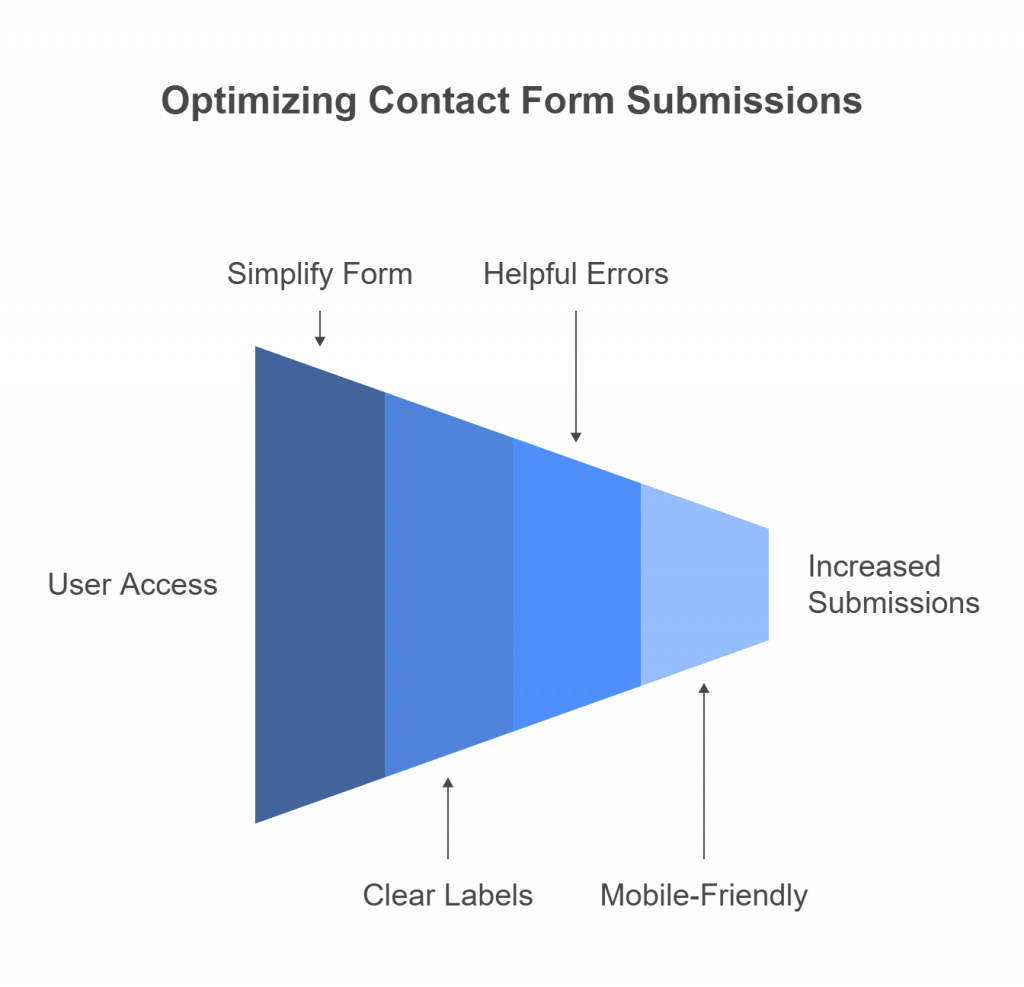
Keep It Short and Focused
The single biggest enemy of a contact form is friction. Every additional field you ask a user to fill out increases the chances they will abandon the process altogether. The goal is to avoid “form fatigue” by only asking for what is absolutely essential to initiate the next step.
For most initial inquiries, a name, email address, and a message field are sufficient. If more information is genuinely required for you to provide value (like for a detailed quote), consider a multi-step approach.
Use Multi-Step Forms When Necessary:
Breaking a longer form into smaller, manageable chunks reduces cognitive load. It feels less intimidating to complete two small steps than one giant one.
Pro Tip:
If you use a multi-step form, always include a progress bar or step indicators (e.g., “Step 1 of 3”). This shows users how far they’ve come and how much is left, encouraging them to complete the process.
Use Clear and Concise Labels
Clarity is king when it comes to form design. Users should never have to guess what information you’re asking for.
Avoid Placeholder-Only Labels:
While placeholder text inside a field looks clean, it vanishes the moment a user starts typing. This forces them to rely on memory, which is a common source of errors and frustration.
The best practice is to use persistent labels that remain visible, typically positioned directly above the input field. This is also crucial for accessibility, as screen readers rely on these labels.
Plain Language Works Best:
Ditch the internal jargon. Use simple, universally understood terms. For instance, “Phone Number” is far clearer than “Primary Contact Info.” The language should be intuitive to a first-time visitor, not just your internal team.
Optimize for Mobile Users
With a significant portion of web traffic coming from mobile devices, a form that isn’t mobile-friendly is a form that’s failing.
Responsive Design:
This is non-negotiable. Your form must automatically adjust to fit seamlessly on any screen size, from a large desktop monitor to a small smartphone screen. All text should be readable and all fields easily accessible without pinching or zooming.
Touch-Friendly Input Fields:
On a touchscreen, precision can be tricky. Ensure your input fields are large enough for a fingertip to tap easily. Furthermore, leverage HTML5 input types to trigger the appropriate keyboard. For example, use type="email" to bring up a keyboard with the “@” symbol, and type="tel" to prompt a number pad for phone fields.
Auto-Fill & Auto-Complete:
Make life easier for your users by enabling browser auto-fill features. Allowing browsers like Chrome or Safari to automatically populate fields like name, email, and address can dramatically speed up the process and reduce typing errors on mobile.
Use Smart Field Validation
Field validation helps ensure you get accurate data, but it can also be a source of major user frustration if implemented poorly.
Real-Time Feedback
Don’t wait until the user hits “submit” to tell them they’ve made a mistake. Provide instant, inline validation that shows a green checkmark for correctly filled fields or a red highlight for errors, such as an invalid email format. This allows for immediate correction.
Helpful Error Messages
Generic messages like “Error” are useless. Be specific and polite. Instead of “Invalid Input,” try “Please enter a valid email address.” The message should clearly state what went wrong and how to fix it.
Don’t Be Too Strict
Avoid overly rigid formatting rules. For example, does it really matter if a user enters their phone number as (555) 123-4567 or 5551234567? Accept multiple formats and clean up the data on your end. Overly strict validation is a fast track to form abandonment.
Make the CTA Button Stand Out
The submit button is the final destination. Its job is to be the most obvious, compelling, and satisfying element on the form.
Strong Visual Hierarchy
Your call-to-action (CTA) button should be impossible to miss. Use a bold, contrasting color that stands out from the rest of the form and the page background. Make it large enough to be easily clickable, especially on mobile.
Action-Oriented Text
Ditch the generic and uninspired “Submit.” Use text that reflects the value the user will receive. For example:
- “Get My Free Quote”
- “Schedule a Demo”
- “Download the Guide”
- “Talk to an Expert”
Placement Matters
Position the button logically, right after the last input field. This creates a natural downward flow and prevents users from having to hunt for it or scroll unnecessarily.
Build Trust and Reassure Users
Users are more cautious than ever about sharing their personal information. It’s your job to make them feel safe and secure.
Privacy Assurance:
A simple, concise statement can work wonders. Add a small note near the submit button like, “We respect your privacy and will never share your information.” This small reassurance can significantly boost confidence.
Social Proof & Certifications
If applicable, display trust signals near the form. This could include security badges (like SSL certificates), logos of well-known clients, or a brief testimonial. These elements act as third-party validation that you are a credible organization.
Use Clear Expectations
Briefly tell users what will happen next. For example: “We’ll respond to your inquiry within 24 business hours.” This manages expectations and reduces post-submission anxiety.
A/B Test Form Variations
You can follow every best practice, but the only way to know for sure what works best for your audience is to test.
Test Field Length, Order, and Label Wording
Seemingly minor tweaks can yield surprising results. Try a version of your form with fewer fields, reorder the existing ones, or change the wording of your labels and CTA button.
Experiment with Form Placement
Is your form best embedded directly on a service page, presented as a modal pop-up, or placed on its own dedicated landing page? Test different placements to see which one generates the most engagement.
Use Data to Decide
Don’t rely on gut feelings or what you think looks best. Use analytics and user behavior data to make informed decisions. The numbers will tell you which variation is the true winner.
Monitor and Optimize Continuously
An optimized contact form is not a “set it and forget it” project. It’s an evolving tool that requires ongoing attention.
Track Form Analytics
Use tools like Google Analytics or heat-mapping software like Hotjar to understand how users interact with your form. Pay close attention to the “drop-off rate”—the point at which users abandon the form. This is your biggest clue as to where the friction lies.
Iterate Based on Feedback
If you receive user feedback, listen to it. Regularly review your form’s performance data and make iterative improvements.
Stay Updated on UX Trends
The world of digital marketing and user experience is always changing. Keep an eye on new design principles and usability trends to ensure your form never feels outdated.
Read More:- Why a High-Quality B2B Email List is the Key to Higher Conversions?
Read More:- 7 Proven Ways To Improve B2B Email Marketing Strategy
Final Thoughts
Creating a high-performing contact form is a blend of science and art. By focusing on simplicity, clarity, and trust, you can transform it from a mere utility into a powerful conversion machine.
The eight practices we’ve covered from keeping it short and mobile-friendly to testing and continuous monitoring – provide a comprehensive roadmap. They work together to enhance user experience, boost conversion rates, and deliver cleaner, more valuable data to your business.
Take a few minutes today to audit your current contact forms. Challenge yourself to apply at least three of the changes from this list and watch your gateway to conversions open wider than ever before.